Was this October really warmer than most Octobers?
MP 65: It was in many places, but what about my local area?
Visualizations of specific aspects of climate change have gotten quite effective over the years. However, most of the visualizations I see are based on gobal or regional datasets. They often leave me wondering what it would look like if the data used were more specific to my local community.
One of the benefits of being a programmer is that you can often recreate a visualization you’re interested in using local data. In this post I’ll take a quick look at some local data to see if this October was warmer than typical Octobers in southeast Alaska. It sure felt warmer.
Qualitative observations
Many local climate change impacts are noticed qualitatively. Even without measuring anything, you can feel that current conditions are different than long-standing patterns. This October we noticed a number of things:
- A distinct lack of frosty mornings.
- When it was colder at night, it warmed up quickly into quite mild days.
- We didn’t feel a need to build fires in the wood stove as often as we used to. When we did, we let them burn out most days instead of keeping them going all day.
This wasn’t just me, or just my family. In face to face and online conversations, people were sharing their perceptions of how much different this October felt than most.

Guiding questions
Even a quick investigation should have some kind of guiding question, to give some purpose to the visualizations you end up making. A couple specific questions I have are:
- Was this October really warmer than most Octobers, or have I just lost track of other warm Octobers?
- Was there any difference between daytime highs and nighttime lows, and average daily temperatures, compared to long-term trends?
- If you could model an “average October”, how would this year’s temperatures compare to that average year?
I’m going to start by answering the first two questions. I’ll make a series of visualizations showing the last 40-ish years of high and low temperatures in October. On each of these plots, this year’s temperatures will be highlighted.
Loading data
You can find data for your region through NOAA’s archives.1 With pandas, we can load the data we’re most interested in with just a few lines of code:
from pathlib import Path
import pandas as pd

path = Path('wx_data/sitka_temps_1983_2023.csv')
df = pd.read_csv(path)
df['DATE'] = pd.to_datetime(df['DATE'])

dates = df['DATE']
highs = df['TMAX']

print(dates[:5], highs[:5])
The bulk of the work is done in the call to read_csv(), which reads the CSV file and returns a DataFrame instance. We then convert the date strings to datetime objects, and print the first few dates and high temperatures:2
$ python october_temps.py
0   1983-09-01
1   1983-09-02
2   1983-09-03
3   1983-09-04
4   1983-09-05
Name: DATE, dtype: datetime64[ns]
0    62.0
1    59.0
2    57.0
3    55.0
4    57.0
Name: TMAX, dtype: float64
This looks right; the first few dates start in 1983, and those look like reasonable high temperatures for that time of year.
Filtering for October data
The dataset starts on September 1, 1983, and should include all dates between then and November 1, 2023. We’re only interested in each year’s data for October, so let’s filter for those dates:
from pathlib import Path
import pandas as pd

path = Path('wx_data/sitka_temps_1983_2023.csv')
df_all = pd.read_csv(path)
df_all['DATE'] = pd.to_datetime(df_all['DATE'])

# Keep only October's data for each year.
df_october = df_all[df_all['DATE'].dt.month == 10]

dates = df_october['DATE']
highs = df_october['TMAX']

print(dates[:5], highs[:5])
We’re working with two DataFrame objects now. The first contains all the data that was pulled in, so I renamed that as df_all. The second only has data from October, so I’m calling that df_october.
The bold line above looks through all the data in df_all, and keeps only the data where the month corresponds to October:
$ python october_temps.py
30   1983-10-01
31   1983-10-02
32   1983-10-03
33   1983-10-04
34   1983-10-05
Name: DATE, dtype: datetime64[ns]
30    56.0
31    53.0
32    52.0
33    51.0
34    52.0
Name: TMAX, dtype: float64
The dates here are correct, and a quick look at the first part of the data file shows that the temperatures are correct as well.
Visualizing the data
Now we can plot the data. To start out, we’ll plot 2023 in red, and all the other years in light gray. Here are the most important parts of the plotting code:
...
import matplotlib.pyplot as plt

path = Path('wx_data/sitka_temps_1983_2023.csv')
...

# Keep only October's data for each year.
df_october = df_all[df_all['DATE'].dt.month == 10]

# Visualize data.
fig, ax = plt.subplots(figsize=(10, 6))
title = "October 2023, Sitka AK"
ax.set_title(title, fontsize=18)
ax.set_xlabel("October __")
ax.set_ylabel("T (F)")

# Plot each year as a separate line.
for year in range(1983, 2024):
    df_current_year = df_october[df_october['DATE'].dt.year == year]
    dates = df_current_year['DATE']

    # Want integer days, not actual dates for plotting.
    days = df_current_year['DATE'].dt.day
    highs = df_current_year['TMAX']

    # Set line style by year.
    if year == 2023:
        ax.plot(days, highs, color='red', alpha=0.6)
    else:
        ax.plot(days, highs, color='gray', alpha=0.2)

plt.savefig("october_highs.png", bbox_inches="tight")
We use range() to loop over the years we want to focus on. For the x value, we just want the day. That is, the temperature for October 3, 1983 should be plotted at the same x position as the temperature for October 3 in all other years. The variable days refers to a pandas Series containing only these integers. The if-else block plots each year’s data in the appropriate format.
Here’s the resulting plot:
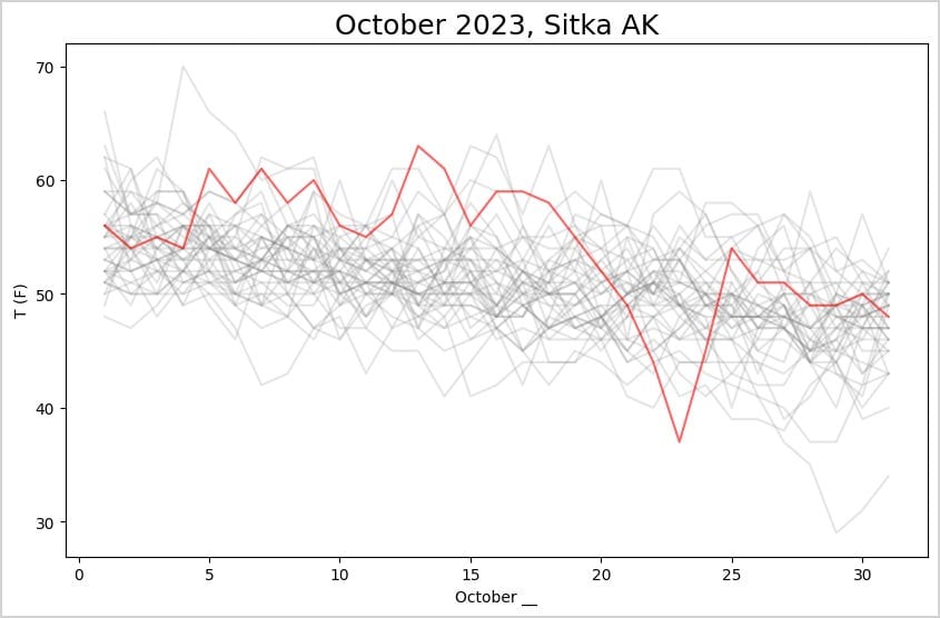
For most of the first half of the month, the daily high temperature was near the highest temperatures in the last 40 years. One of these days had the highest October temperature in that timespan, and one day had the lowest high temperature in that timespan.
Highs and lows
High temperatures are a snapshot of each day. To get a better sense of the overall weather during October, we should look at the full temperature range for each day. The following version plots high temperatures in shades of red, and low temperatures in shades of blue. For 2023, the region between the highs and lows is shaded:
...
for year in range(1983, 2024):
    df_current_year = df_october[df_october['DATE'].dt.year == year]
    dates = df_current_year['DATE']

    # Want integer days, not actual dates for plotting.
    days = df_current_year['DATE'].dt.day
    highs = df_current_year['TMAX']
    lows = df_current_year['TMIN']

    # Set line style by year.
    if year == 2023:
        ax.plot(days, highs, color='crimson', alpha=0.6)
        ax.plot(days, lows, color='deepskyblue', alpha=0.6)
        ax.fill_between(days, highs, lows,
                facecolor='slateblue', alpha=0.07)
    else:
        ax.plot(days, highs, color='pink', alpha=0.2)
        ax.plot(days, lows, color='lightskyblue', alpha=0.2)

plt.savefig("october_highs_lows.png", bbox_inches="tight")
We pull the low temperatures from df_current_year into lows. Then we plot the low temperatures for all years. For 2023 we use fill_between() to highlight the region between that year’s high and low temperatures. I also changed the colors to indicate which lines represent low temperatures, and which represent high temperatures:
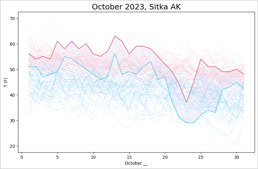
This gives a much clearer sense of how October of this year compared to previous years. For the first half of the month, the highs were among the highest October temperatures of the last 40 years, and the lows were among the highest lows. Then there was a big shift that included one of the lowest high temperatures in the last 40 years, with correspondingly cold nights.
Rolling averages
Whenever I look at a plot of daily temperatures, I’m always interested in what a smoothed-out version of the data would look like. It’s not always relevant, but I’m almost always curious to take a look at it.
Here’s a version of the plot that looks at 5-day rolling temperatures through each year’s October highs and lows:
path = Path('wx_data/sitka_temps_1983_2023.csv')
df_all = pd.read_csv(path)
df_all['DATE'] = pd.to_datetime(df_all['DATE'])

df_all['rolling_highs'] = (
    df_all['TMAX']
    .rolling(window=5, min_periods=1, center=True)
    .mean()
)
df_all['rolling_lows'] = (
    df_all['TMIN']
    .rolling(window=5, min_periods=1, center=True)
    .mean()
)
...

for year in range(1983, 2024):
    ...
    # Want integer days, not actual dates for plotting.
    days = df_current_year['DATE'].dt.day
    highs = df_current_year['rolling_highs']
    lows = df_current_year['rolling_lows']
    ...
This adds two new columns to df_all, 'rolling_highs' and 'rollling_lows'. Each of these is calculated in the same way:
- Pull the appropriate temperature readings from
df_all; - Use the
rolling()method withcenter=Trueto get the previous two days, the current day, and the next two days; - Use
mean()to calculate the mean temperature over those five days.
When we plot the data, highs and lows are filled from the rolling average columns. The resulting plot is smoother, as expected:
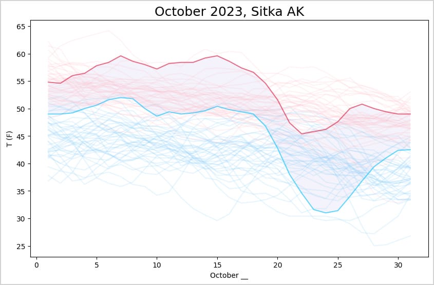
I’m not sure how much better this is for considering what this October was actually like. It does highlight that the overall trend was warmer for the first half of the month, and colder for a short period at the end of the month. The averaging loses details like the days with outlier temperature readings. I think I like rolling averages better for longer timeframes, such as years.
Conclusions
If you’re comfortable generating exploratory graphs quickly, you can dig into weather data relevant to your specific community rather than relying on what’s presented by others for a larger region.
Libraries like pandas are great for these quick data explorations. With pandas, you can do exactly the kind of data filtering and shaping you want in just a few lines of code. If I were to do this again I’d probably use Plotly to generate the graphs, because I’d like to mouse over some of the lines and see the data points for specific years, and some of the most extreme temperatures recorded during this timeframe.
AI assistants make this kind of exploratory work more efficient than ever. For example I’ve used the rolling() method before, but I haven’t memorized the syntax and options needed for this specific analysis. But giving GPT a DataFrame and asking it how to get a 5-day rolling average is something these AI assistants excel at. It did try to get me to only use October data for the rolling averages, which was an odd thing to push. It’s really important to be clear what you want to get from an AI assistant, and not just dump what it gives you into your own codebase.3
Resources
You can find the code files from this post in the mostly_python GitHub repository.
To download your own dataset:
Go to NOAA’s Climate Data Online site.
Click the Search Tool.
Under Select Weather Observation Type, choose Daily Summaries. Then set your date range, and select Zip Code under Search For. Click the Search button.
On the next page you’ll see something like Sitka, AK 99835. Click the View Full Details link.
Click the Station List link.
You’ll see a list of station names, along with some information about the range of data available from each station. When you’ve found a station you want to get data from, click the Add button. Then scroll to the top of the page and click on the Cart button; it’s set up as a shopping cart, but there’s no charge for the data and you don’t need an account.
On the next page, change the output format to Custom GHCN-Daily CSV. Click Continue.
On the next page, select the kind of data you want included in your download. Consider including everything available if you’re not sure how much analysis you’ll do; with pandas, it’s easy to select exactly the columns of data you’re interested in later.
On the next page, enter your email address and click Submit Order. You’ll get an email confirming the request for data, and usually you’ll get a link to download the data in another minute or two. ↩
If you’ve never used pandas before, MP #33 includes some more detailed explanations of the pandas code shown here. ↩
To clarify, I was using a centered 5-day rolling window. That means the first day of October should include the last two days of September and the first three days of October. This makes perfect sense in the context of “Let’s look at weather patterns in October.”
GPT was overly fixated on the fact that I wanted to visualize October weather; it tried to exclude the September and November data from the rolling averages. It was taking a very literal interpretation of “focus on October weather”. ↩